
Lessons Learned, a Website Made
Hello World!
Welcome to my official website where I’ll be posting about my projects, dev-blogs, learning experiences, and more. It’s been an awesome opportunity to learn, be creative, express myself, and work towards my goals all wrapped into one.
The Idea
Back in February, with my co-op term approaching, I needed to get something out there to show off my skills and experience, I needed a portfolio. These days, that usually means building a website, even a small one, so people can view your work from anywhere. So I started investigating.
Despite having no web development experience, I knew I didn’t want to use a standard website builder. I wanted my website to be representative of me, what I care about, and what I make. As the idea brewed in my mind, I realized I didn’t just want to show off what I’ve done. I liked the thought of having a space to document my ideas, reflect on my learning, and share even the messier parts of the process as I go.
To make that possible, I needed full control of my space, and while there are hundreds of ways to make a website, Jekyll was the one I found to be best suited for my needs.
In case you don’t know, Jekyll is a static-site generator that builds websites from markdown files and YAML front matter with hundreds of free, open source themes. It also has built-in functionality with GitHub Pages for free and easy hosting and automatic deployment. Given that I also wanted to learn more about Git, this seemed like a perfect choice that allowed me to customize my website freely while learning a couple new skills. But, before I could start developing, I had to choose a theme. I chose to go with Minimal Mistakes due to its simplicity, thorough documentation, and compatibility with GitHub Pages (since not all themes are).

How Hard Could It Be?
With Jekyll and GitHub Pages, there are a few ways to use themes: remote, as a Ruby gem, or a local clone. Each with their own advantages and disadvantages.
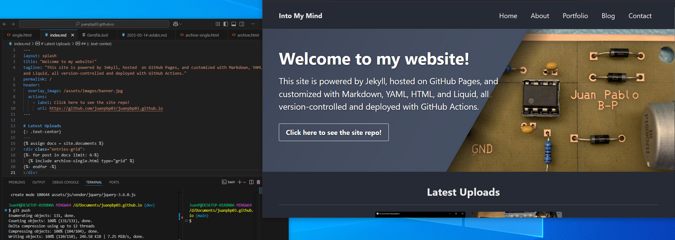
To start, I used the remote version of Minimal Mistakes. It was lightweight, easy to plug-and-play, and didn’t clutter my workspace with files I wasn’t planning to use. This came with limitations, those being:
- no plugin support
- no access to theme files
- no layout or style modifications
Despite knowing the limitations, I felt I wouldn’t make too much use of those features and I managed to piece together:
- A splash page
- A temporary About page
- Blank Portfolio and Blog pages
- A basic post feed and header images
- Google Analytics
All while learning how to manage my project with Git. But those limitations started to show pretty quickly. With custom layouts off-limits, pages looked half-finished, and I had less freedom than I had anticipated. Eventually, with school taking priority, I had to put the site down for a while.
Going Beyond (Plus Ultra)
As the semester wrapped up and I came back to it, I wasn’t satisfied with what I had. While the site technically worked and I could upload posts as it was, it didn’t feel complete yet. I wanted it to be something that reflects the effort I put in and the pride I take in all my projects.
This started with switching over to the Ruby gem version of the theme which let me override the layout files by replacing them with my own. I also switched deployment from the automatic GitHub Pages to a custom GitHub Actions workflow which gave me the ability to use any plugin I wanted, not just the Pages compatible ones.
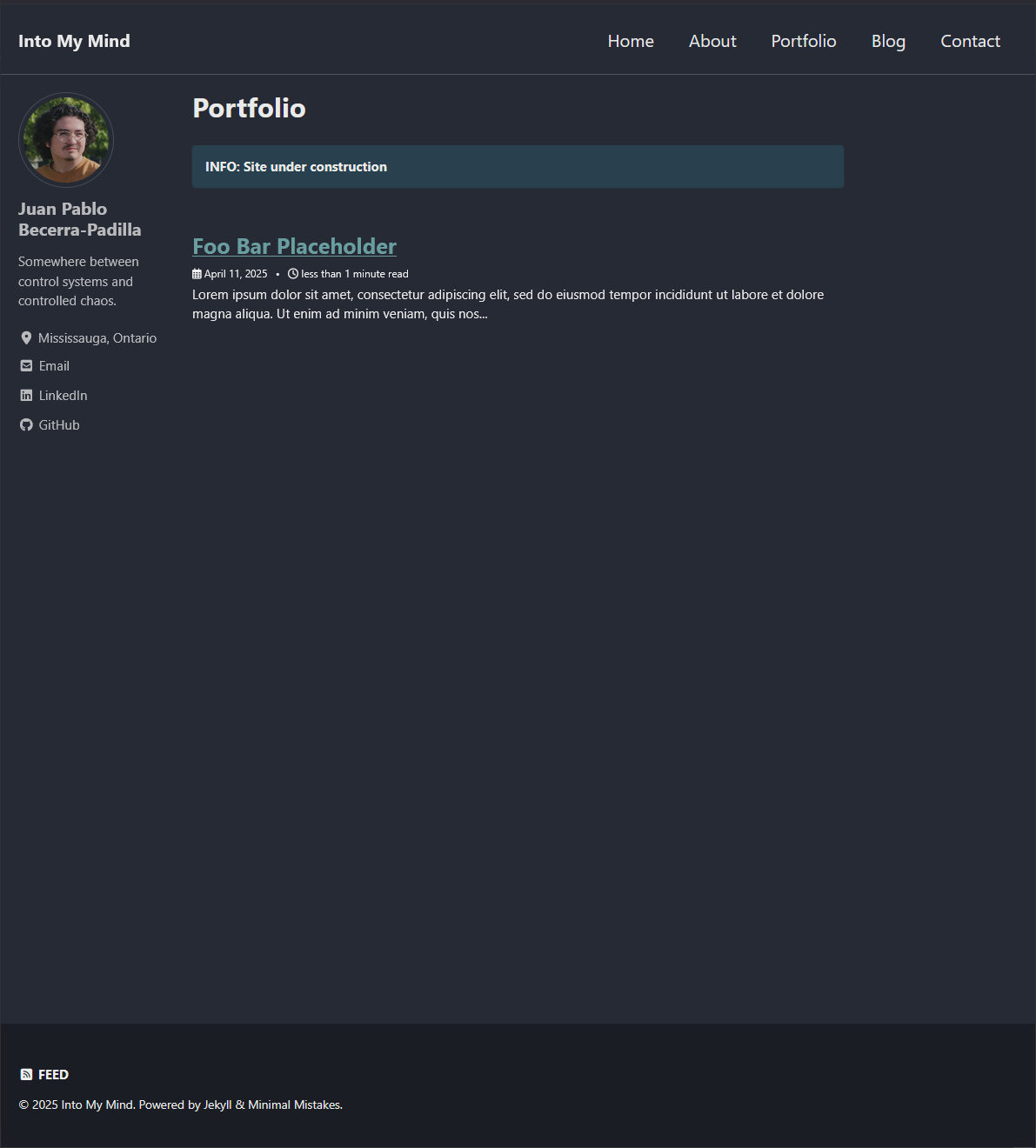
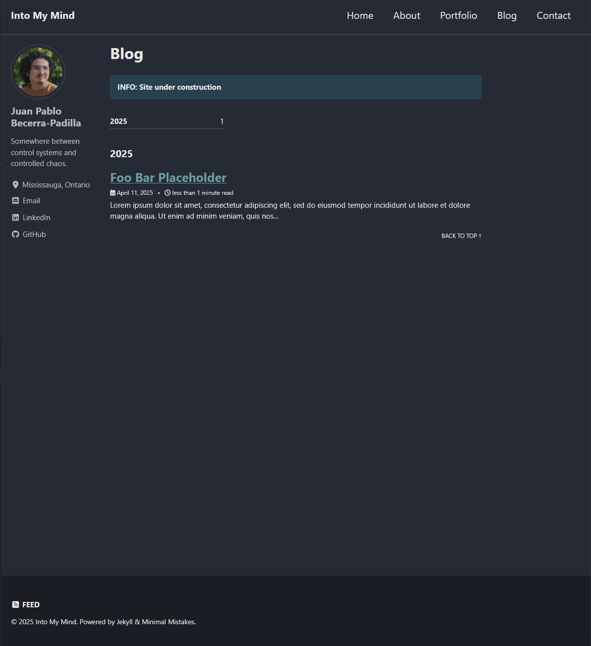
I continued developing my website, finalizing the About page, creating two short portfolio items, and adding post tags and a contact page. With this, I had finished a first draft. After receiving some feedback, the limitations of the theme itself came to light:
- Posts were missing thumbnails
- Only blog posts would show up on tag archive pages
- There was no way to browse all tags
- Breadcrumb navigation was broken
- Related posts only showed blog posts and wasn’t actually related
To fix all of these issues, I had to take the final step and switch to a local clone of the theme repository. This gave me easy access to start modifying any theme file I wanted, and development took off:
- I wrote custom liquid to process teaser images for archive views and display them on my splash page
- Edited the SCSS files to properly format the images
- Implemented archives that worked for all types of content
- Added blog post categories to fix breadcrumb functionality
- Adapted a related posts script from another developer’s blog to generate related posts for any collection
To top it off, I created a brand new splash page and added resume download links. Needless to say, while making all these changes, using Git for version control really paid off. I’ve lost count of how many times git restore . saved my website from disaster.
Launch
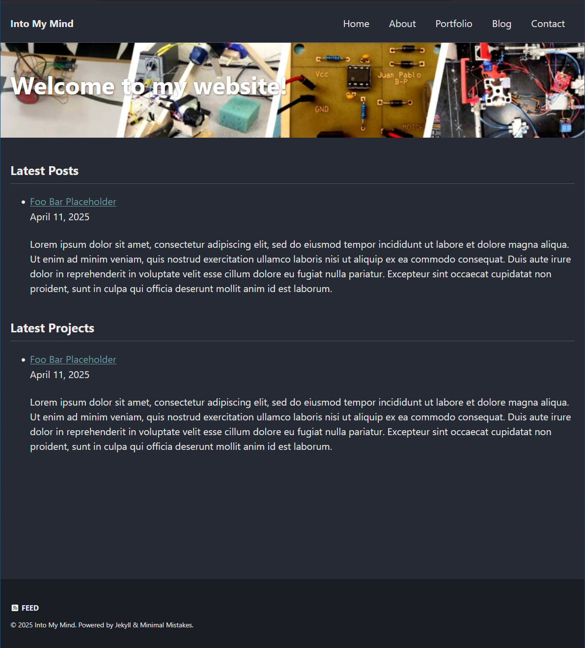
After weeks of on-and-off development, a lot of trial and error, and way too many browser tabs open at once, I finally have something I’m happy to call mine.
The site is live! The new banner looks great, the content is organized, and I have two portfolio posts, this very blog post, and an About page that finally says something that feels right.
Takeaways & Next steps
This project ended up being more than just a way to showcase my work. It became a space to explore, to experiment, challenge myself, and learn things I never expected to touch, like Liquid templating, SCSS, and even a little bit of graphic design.
More than that, it became a place to think out loud. Somewhere to organize not just what I’ve made, but how I think and what I care about.
There’s still more I want to add. More posts, more projects, maybe even some visual changes down the line. But for now, it’s a start.
Get In Touch
If you’ve got thoughts to share, feedback, or just wanna say hi, feel free to reach out on LinkedIn or send me a note from the Contact page.